 1
1 2
2 3
3For the contemporary image I have selected Andy Warhol's Pop Art piece of Marilyn Monroe. My attempt was to re-interpret this image into a new work that is representative of another movement. The movement I chose to represent is Expressionism. I first applied a filter as 'Graphic Pen' which is the second image and then applied a gradient onto the image which is the third image, this was achieved hrough the electronic application of Photoshop. Expressionism represented with the diagonal strokes of a graphic pen giving it a distorted line look with the exaggeration of a dark green almost black. However this does not exaggerates the initial image and connects a relationship with it. So I re-edited it again and applied a pastel gradient that was complimentary of the subject and connected the subject with the elements.

The emotional impact given is the soft delicate beauty of Marilyn Monroe using a pastel gradient. It still has kept the key elements of Andy Warhol's Pop art style, how there is hardly any fine detail and minimal use of colours. The image is still fundamentally pop art but it is represented in an Expressionist way. Marilyn is now expressed with the use of line's and her beauty is expressed with the subtle pastel colours expressing the image of beauty and delicacy,
I figured it doesn't exactly do justice to the Expressionist way and Ive tried tweaking the meaning to encompass it but to fix this I edited with it once more in Photoshop and applied another filter under Distort which is called Ocean Ripple.

I do believe this is a much better interpretation of the movement of expressionism whilst still maintaining the fundamental elements that inform the viewer of the original Pop Art movement and image.
However on a new note I have not taken into account the reason or proposal of why Andy Warhol particularly chose Marilyn Monroe. When looking back at his works it is interesting to note that certain subjects were chosen based on their popularity. He was distinctly american and his works reflected the rapid growth of commercialism and energy of post World War II America. It is also interesting to note that he was infatuated with the star's of the century, the ongoing popularity of Hollywood and celebrity culture. He chose Marilyn as she was centre stage in Hollywood, being noted as 'tragic' due to her high fame and the downfall of her nature in the later years. She was a gorgeous rising star that came crashing down with the circumstances of her death being subjected as 'conjecture' on account of overdose of drugs.
Gathered from the notes above I should have considered to try and change my re-interpretation to incorporate these idea's. To make matters more contemporary I could change the subject of my art to a more recent celebrity that rose high in fame and died in a tragic circumstantial way. For instance Amy Winehouse, gorgeous talented woman whom rose strikingly high in the celebrity culture, not one person could say today that they haven't heard of Amy Winehouse. She is a clear connection with Marlilyn through this.

This is the image I have chosen of Amy to begin my second attempt at my re-interpretation. I plan to edit her image in photoshop to create a pop art style of her or something close to it as I wish to achieve the final image of Marilyn with Amy.


The bottom right image of Amy was the first step and that was to apply the filter posterize to achieve the initial idea of pop art by reducing the details and creating basic image. The top left image was when I applied the gradient field onto it and chose the pastel colours of green yellow and blue.After this I attempted to apply the graphic pen sketch feature to create a feel of expression like with my marilyn images. However the colours were taken away and it was reduced to black grey and white, when I applied the gradient again it didn't have the three colours I initially wanted and fazed into a bare two green and yellow. I tried amending this by just selecting a different gradient such as the brown mocha one on the bottom left. None of these seem to achieve what I wanted in my re-interpretation.


I started from scratch again this time just applying graphic pen straight away and then the gradient field over it. When flattening the image I again lost the third colour however I am not stressing about the third colour because I am not trying to re-create a pop art image I am trying to re-create Andy Warhol's pop art of Marilyn Monroe with Amy Winehouse keeping to the ties of pop art but not strictly and re creating it in an "expressionist' interpretation.

Therefore I applied my final filter of 'Ocean Ripple' to achieve the distorted image that interprets 'Expressionism'. Amy is therefore not as clearly detailed like Pop art but created in a way where it shows a state of expression through the minor detail of filtered graphic pen, distorted by the effect of 'Ocean ripple' helping me to achieve my re-interpretation of the art movement Expressionism.
I thought about reinterpreting Amy Winehouse not so that it would look like a replica of Andy Warhol's but more of different contemporary style. Images are fairly edited in a way that they look more complimentary and pretty with models being thinned down and lighted up to show a gorgeous person. Screw this. I want to take it in a direction where the viewer is shocked. Fiddling with my filters and thinking about what Amy represented, a tragic death, I realized I wanted this to be seen. Her death was a tragedy and what is seen with death? Blood. I have a range of filters that have blood splatter that I could apply to the image. Question is to make a big statement should I black and white the photo or keep it's colour? So I decided to try both. So using Andy Warhol's idea of printing the ever tragic gorgeous Marylin I myself have chosen a more recent famous star Amy Winehouse and using the contemporary of editing images through the contemporary program of Photoshop have re-interpreted the tragic gorgeous Marilyn in a way that expresses her tragedy plain and clear through applying a blood splatter brush.


I personally think that the black and white image of Amy is a more eccentric image and stands out portraying the image much clearer. The black and white add to the emphasis of a dark and saddening emotion where as the vibrant red blood splatter draws out the tragedy and horror of her death of a gorgeous young lady.
I had fun with this and thought why stop at Amy? I remembered other celebrities that's death shocked society, Michael Jackson, is another appropriate subject due to his history much like Amy he was centre stage in spotlight for his wonderful music even being titled as the "King" of pop.


This could potentially become another series of works if I chose to develop it further.
Whitney Houston again died and had a long battle with drugs like Amy.


Research
David Hockney and his "Joiners" works. He was first recognised with his works that involved painting L.A swimming pools. Following through he painted enteriors and exteriors of California homes. While working on a painting of a Los Angeles living room, he took a series of photos for his own reference, and fixed them together so he could paint from the image. When he finished, however, he recognized the collage as an art form unto itself, and began to create more. This led to the creation of his first “joiner,” an assemblage of Polaroid photos laid out in a grid.

Cindy Sherman and her famous early series Untitled Film Stills, taking photographs of herself dressed as invented characters embodying female clichés, such as ‘the bored housewife’, ‘the sexy librarian’, and ‘the ambitious career girl’. Sherman continued to use herself as a subject in several other series, including her History Portraits, in which she inserted herself into Old Master paintings as a way of reexamining the role of the female within them. She mainly photographed herself in disguises, and explored the darker side of culture in her depictions of perverted fairy tales, war, and sex. Through her work, Sherman examined anxiety, disgust, the lurid, and the grotesque.

Joel Peter Witkin
Witkin's work often centers on death and corpses as themes; he has frequently featured dismembered corpses in his work. These dark themes were inspired by a childhood incident in which Witkin encountered the dismembered head of a girl after a car accident. The look of early Daguerreotypes and the works of E.J. Bellocq (American, 1873–1949) also inspire his art. Witkin's work with corpses is created primarily in Mexico, where there are fewer restrictions in the handling of dead bodies. After taking his photographs, Witkin puts them through an extensive development process. He uses a hands-on chemical development method, often bleaching his prints, toning them, or scratching the negative.

Ashley Bickerton is a contemporary A mixed-media artist, Bickerton often combines both photographic and painterly elements with industrial and found object assemblages. He is associated the early 1980s art movement Neo-Geo, which includes artists such as Jeff Koons and Peter Halley. His work has explored issues in contemporary art related to the commidification of the art object itself. Often his objects are grotesque in a self-aware manner and are often a critique of capitalism.
Marcel Duchamp
"If it's not shocking it's not worth doing"
Was french American Artist and is recognized as the greatest influence in 20th century Art. He challenged conventional thought about artistic processes and rejected the emerging art market, through subversive anti-art. He famously dubbed a urinal art and named it Fountain. Duchamp produced relatively few artworks, while remaining mostly aloof of the avant-garde circles of his time. He went on to pretend to abandon art and devote the rest of his life to chess, while secretly continuing to make art.

In 1919, Duchamp made a parody of the Mona Lisa by adorning a cheap reproduction of the painting with a mustache and goatee. To this he added the inscription L.H.O.O.Q., a phonetic game which, when read out loud in French quickly sounds like "Elle a chaud au cul". This can be translated as "She has a hot ass", implying that the woman in the painting is in a state of sexual excitement and availability. It may also have been intended as a Freudian joke, referring to Leonardo da Vinci's alleged homosexuality
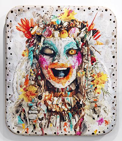
After researching the artists I re-atempted my art piece and tried to instill the idea's and contemporaries behind their works. Such as how Duchamp drew a moustache, I too have using photoshop techniques such as copying and pasting drawn a moustache on Andy Warhol's Marilyn Monroe. Ironically I went for the Salvador look alike moustache. After doing this I seen an image of drawn on image with chalk and got the inspiration to try it myself. I want to print out Marilyn in black and white and then draw over her in coloured chalk add other little bits to her image not just a moustache. And add in external comteporary influences such as vampire's and zombies and werewolves because it's a popular theme amongst generations to read and watch and play games about. I looked to my books for influence and found Darren shan which had demonic eyes and a sewn up face which I incorporated.


This one took an hour to do the lips eyes and face.
 This was a long drawn out process. With alot of editing and going back over to the original button. Should have just printed it. And stolen buttons off my family members clothes and attached them.
This was an interesting process of applying research to my contemporary image I particular want to go further in the image of Marylin and and applying Bikerten's conception by changing variables. I want to try and attempt to change the colours of Marilyn.

I dont particularly like the colours but the transition is quite unique. From Pop art to using Bikerton to creating an oompa loompa. My thoughts were not focused on Willy Wonka's characters it was more or less trying to put opposite different colours in that clashed against the original ones.
Installing the image, was slightly unsure of which image I wanted to use in final So for good measure I printed both the normal colours and the oompa colours image. I wanted to go big and decided to print in A3. What I didn't anticipate was the fact the image could be pixelated due to upscaling the size. However I seem to like the affect it had on the image.


If I were to install these in a proper studio I would prefer a studio where there is more art and craft type stuff to compliment the effect of the buttons and have a blank wall to install them on. The image itself is fairly busy and otherworks around it could overload the effect it has.
No comments:
Post a Comment